
Overall Scope of Project
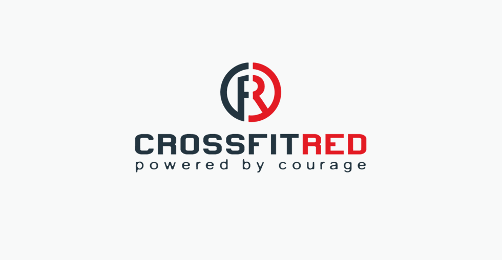
I recently collaborated with two really great guys, Patrick Bland and Cole Lovette, from the Crossfit Red gym here in Grand Junction. Patrick, owner of Crossfit Red, was looking to update / streamline his current logo in preparation for use across multiple platforms – ie marketing materials, swag, web, apparel, etc. After chatting we determined they needed something clean, modern and simple enough to reproduce in both large and small scale formats. They already had a strong concept behind the original mark, and we weren’t looking to completely reinvent their identity – we wanted to maintain the brand loyalty they’d already established. So, in essence this became more of a brand ‘make over’.
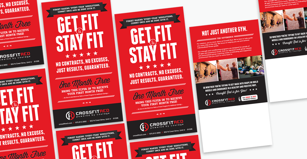
The new mark is now immediately more dynamic in appearance. We updated the original deeper toned red to a purer, primary version. The main font I used is a heavier-weighted sans-serif. And the use of all lowercase letters in the tagline offsets the mass of the other pieces. Overall I think the new logo now easily holds its own, and transitioned successfully onto their most predominate mediums such as print and apparel.